The Helmhotz' Irradiation, Cafè Wall and Bulging Checkerboard Illusions
By Grant OceanThe Helmhotlz’ Irradiation Illusion
The Helmhotlz’ irradiation illusion, as shown in the two figures below, is created by two figures of the identical size (both inside and outside squares), but the small black square which is inside the larger white square (shown in the figure on the left below) looks smaller than the small white square inside the larger black square (shown in the figure on the right below). This is a very strong illusion and the size difference between the small squares inside the larger squares is obvious and impressive. However, this is not a popular illusion in the textbook and almost none of the websites dedicated to the visual illusions has included this size illusion. Thus, it is hard to find any explanation for the illusion. Helmholtz, the discoverer, himself used the principle of irradiation to explain the observation; the term "irradiation" refers to the spreading of light areas into adjacent dark areas, where an increase in the size of a bright area would occur at the expense of an adjacent dark area. This leads to apparent displacement of a black-white boundary so that the contour appears shifted in the direction of the dark area.
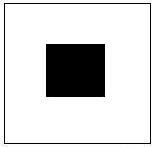
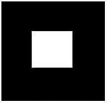

Since the publication of Murray et al.´s
study in 2006, we now know that two objects that project the same
visual image size on the retina can appear to occupy very different
properties of the visual field; thus, a object that appears to occupy a
larger portion of the visual field can activate a larger area in
primary visual cortex than an object of equal image size that is
perceived to be smaller in the visual field. We can assume that the
small squares in the standard Helmhotlz illusion are the same size on
the retina; the perceived difference in size must have happened in the
primary visual cortex. The next question is why the white small square
is perceived to be larger than the black small square in the primary
visual cortex. As is well known, light exerts physical force or energy
which acts
upon our retina and generates sensory stimulation to produce vision. It
is also
a fact that white color reflects (or re-emits) more light energy (or
photons to
be specific) than black color; therefore, the small white square puts
forth a
higher level of energy than the small black square. Because the two
small
squares are identical in size, hence they have the same size but
re-emit different
densities of photons. The small white square has a higher density of
photons (generated
by a higher intensity of light force); thus it may activate a larger
area in the primary visual cortex. The more light energy an object
reflects, the larger the object tends
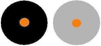
to be perceived. But, as shown in the figure below, the circles of the
same size and same brightness can be perceived to be different in size.
The middle orange circle in the larger black circle on the left below
appears to be brighter and also larger than the middle circle on the
right below although these two middle circles have the exactly same
color, brightness
and size. As such, the fact is that the relatively brighter object of
the same size due to its darker surroundings generates a larger cortex
activity and hence is perceived as larger in size.
So
far we only know this fact that a brighter object or relatively
brighter object with its dark surroundings produces a larger image in
our brain. But we do not know the exact mechanism of the perception. We
can merely assume that it could be the light energy or photons that
exert a force on our cortex. Nevertheless, I am certain that it is a
force, no matter whether it is generated by the photons or something
else, that has an illusory effect on our perception of the Helmhotlz
illusion. A brighter square within a darker larger square or a
relatively brighter circle inside a larger darker circle produces more
force than a less bright square or circle. The strength of the force is
positively correlated with the perceived size of these objects. As a
result, we can conclude that a
brighter object or relatively brighter object with its darker
surroundings exerts a stronger force on its surroundings and on our
cortex which in turn produces a larger image in our brain.We can also call this conclusion a principle.
Equipped with this principle, we can explain another much more popular
shape illusion, called the Cafè wall illusion, and the bulging
checkerboard illusion. The successful application of this principle
will further prove my force approach to these illusions.
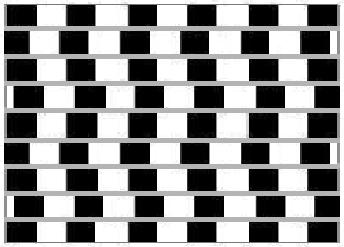
The Cafè Wall Illusion
The famous Café
wall
illusion, as shown in the figure on the left below, was discovered by
the prominent illusion researcher Richard Gregory in 1973. The illusion is created when the tiles of black and white are in the
“half-shifted condition” and the mortar lines (the horizontal lines between the
tiles) appear to slope alternately upward and downward. But the lines are
actually parallel and all tiles are of the same size; when the tiles align (shown in the figure in the middle below) or
make up a checkerboard (shown in the figure on the right below), the illusion disappears.
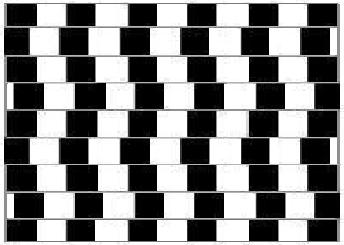
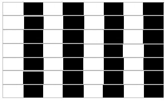
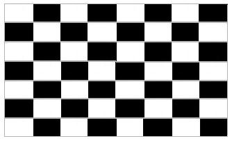
Some psychological articles have given a neuropsychological explanation, suggesting that this shape illusion results from limitations in the balancing act of the inhibitory and excitatory neurons in the brain. We are informed that inhibitory neurons dim down perceived bright areas while excitatory neurons brighten perceived dark areas. Hence, in the Cafè wall illusion, the areas in which white is prominent, become dimmed, and the areas surrounded by dark areas are brightened. When there is a brightness contrast across the mortar line, a small scale asymmetry occurs whereby half the dark and light tiles move toward each other forming small wedges. These little wedges are then integrated into long wedges with the brain interpreting the mortar line as a sloping line. However, this explanation does not inform us of the exact mechanism of the illusion. More importantly, the explanation is contrary to the phenomenon in the standard Helmhotlz illusion as shown below. Instead of being dimmed by the inhibitory neurons as claimed by these neuropsychologists, the bright area actually activates a larger activity in the visual cortex. Thus, this explanation is incoherent.


When there are so many theories to
explain one phenomenon, it usually means that no one theory is
convincing enough to stop others from pursuing a better understanding.
In this case, I am going to use the principle gained from our
understanding of the Helmhotlz illusion discussed earlier to analyze
the Cafè wall illusion: A
brighter object or relatively brighter object with its darker
surroundings exerts a stronger force on its surroundings and on our cortex which in turn
produces a larger image in our brain. Let´s
look at the standard Cafè wall illusion figure below closely.
The black and white tiles are not aligned; otherwise the mortar lines
would be parallel to each other. Instead, the black and white tiles are
stacked on top of each other only half way. (Note: In the standard
Cafè wall illusion figure that I drew the tiles are not tacked
half way; merely about a third of the white tiles is stacked by a
black tile.) Now let´s look at the figure on the right which is a
cut-out of a small part of the standard illusion 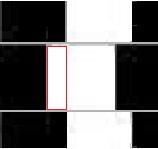 figure
below. We are going to pay close attention to the white square in the
middle of the figure. This white square has black tiles or squares on
its sides and both black and white tiles on its top and bottom. About a
third of its top and bottom is surrounded by the black tiles. The
figure on the right looks similar to the figure on the right above. If
we imagine the white tiles on top and bottom of the middle white square
are black color, then the cut-out figure on the right would be almost
identical to the Helmhotlz illusion figure on the right above. The red
rectangle that I have drawn on the middle white square is the only part
of the white square that is surrounded by the black tiles on the three
sides, i.e., its top, left and bottom sides. Its right side is
surrounded by a black tile but with a gap. If we can ignore the gap
between the red rectangle and its right side black tile, we can regard
this cut-out figure as a Helmhotlz figure with a rectangle rather than
a square in the middle. According to the principle, the white rectangle
with its black surroundings exerts a stronger force on its
surroundings; thus the rectangle will expand like a metal heated up or
a balloon blown up. The force of the expansion spreads in all
directions. When it expands sideways, the force will not affect the
mortar lines. Nevertheless, when the rectangle expands upwards and
downwards, its inflating force will push the mortar line on its top
upwards and push the mortar line at its bottom downwards. Since only
the left third part of the white square is exerting an expanding force
on the mortar lines above and underneath, only left parts of the mortar
lines, not the whole mortar lines, under and above the white square
expand, which is like a pair of parallel bars being pulled apart from
one end. The result is that the end of the parallel bars being pulled
is getting wider than the other end; as a result, a wedge shape is
formed. Similarly, the mortar lines directly above and beneath the
middle white square form a wedge with the wider end on its left and the
narrower end on its right. So this wedge is pointing toward left. When
you look at the standard Cafè wall illusion figure below, you
will notice that in the same row as the cut-out all the white squares
are placed the same way as the sample cut-out. The left sides of the
white squares have consistently more expanding force than the right
sides; therefore, the mortar lines on the whole form a wedge toward
left. This imbalanced force within a single white square is essential
for the illusion. When the expanding force is the same for the entire
top part and bottom part of the white squares as in the checkerboard
figure and aligned figure (shown at beginning of this section), the
illusion disappears. If somebody asks why the mortar lines do not
appear jagged due to a succession of wedges formed by each white
square, I wouldassume that the mortar lines are rigid objects and they only bend as a whole.
figure
below. We are going to pay close attention to the white square in the
middle of the figure. This white square has black tiles or squares on
its sides and both black and white tiles on its top and bottom. About a
third of its top and bottom is surrounded by the black tiles. The
figure on the right looks similar to the figure on the right above. If
we imagine the white tiles on top and bottom of the middle white square
are black color, then the cut-out figure on the right would be almost
identical to the Helmhotlz illusion figure on the right above. The red
rectangle that I have drawn on the middle white square is the only part
of the white square that is surrounded by the black tiles on the three
sides, i.e., its top, left and bottom sides. Its right side is
surrounded by a black tile but with a gap. If we can ignore the gap
between the red rectangle and its right side black tile, we can regard
this cut-out figure as a Helmhotlz figure with a rectangle rather than
a square in the middle. According to the principle, the white rectangle
with its black surroundings exerts a stronger force on its
surroundings; thus the rectangle will expand like a metal heated up or
a balloon blown up. The force of the expansion spreads in all
directions. When it expands sideways, the force will not affect the
mortar lines. Nevertheless, when the rectangle expands upwards and
downwards, its inflating force will push the mortar line on its top
upwards and push the mortar line at its bottom downwards. Since only
the left third part of the white square is exerting an expanding force
on the mortar lines above and underneath, only left parts of the mortar
lines, not the whole mortar lines, under and above the white square
expand, which is like a pair of parallel bars being pulled apart from
one end. The result is that the end of the parallel bars being pulled
is getting wider than the other end; as a result, a wedge shape is
formed. Similarly, the mortar lines directly above and beneath the
middle white square form a wedge with the wider end on its left and the
narrower end on its right. So this wedge is pointing toward left. When
you look at the standard Cafè wall illusion figure below, you
will notice that in the same row as the cut-out all the white squares
are placed the same way as the sample cut-out. The left sides of the
white squares have consistently more expanding force than the right
sides; therefore, the mortar lines on the whole form a wedge toward
left. This imbalanced force within a single white square is essential
for the illusion. When the expanding force is the same for the entire
top part and bottom part of the white squares as in the checkerboard
figure and aligned figure (shown at beginning of this section), the
illusion disappears. If somebody asks why the mortar lines do not
appear jagged due to a succession of wedges formed by each white
square, I wouldassume that the mortar lines are rigid objects and they only bend as a whole.

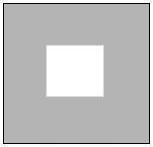
The force explanation I have offered based on the
principle can predict many variations of the standard Cafè wall
illusion. As shown on the right, the white small square inside the
larger lighter gray square appears to be 
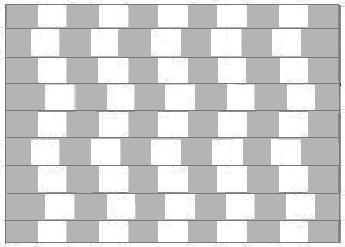 slightly
smaller than the white small square inside the larger black square.
According to the principle, we would predict that the white tiles
surrounded by the lighter gray
tiles will exert a weaker force on the mortar lines; hence the wedges
will be significantly diminished. The figure on the left is the same
figure as used for illustrating the standard Cafè wall illusion;
but the color of the black tiles has been changed into the light gray
to match the color of the second figure on the right. As you can see,
the mortar lines do not appear to tilt one way or other, and the mortar
lines seem to be parallel to each other. The illusory effect is by and
large gone. As a result, the Helmhotlz illusion figures on the right can
correctly predict the outcome of the variations of the Cafè wall
illusion. This experiment also tells us that there is a threshold for
the force to bend mortar lines. When the force exerting on the mortar
lines is under the threshold, the mortar lines will not tilt at all and
the illusion will be weakened or eliminated completely. If this is the
case, we can predict that the wedges in the standard Cafè wall
illusion will not be formed by the mortar lines when the width of the
mortar lines is increased to a certain point. The logic is that the
mortar lines
  have to be bent by a certain amount of force; when the
force pushing the mortar lines is fixed, the stronger the mortar line,
the harder it is for this given force to move it. As shown in the
figure below, the illusion is significantly diminished when the mortar
lines are thickened to the degree that the mortar line is strong enough
to resist the force pushing on it. As a result, the prediction comes
true. The application of the principle discovered for the Helmhotlz
illusion to the Cafè wall illusion can be claimed to be
successful.
The Bulging Checkerboard Illusion
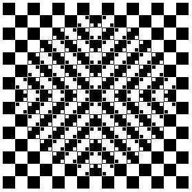
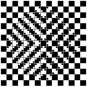
The figure below is called the Bulging checkerboard illusion. The illusion looks like the checkerboard bulging right off the screen. But this bulge is illusory because the checkerboard is fully regular and each check is a regular square. So far there is not any credible explanation out there for the illusion. Akiyoshi Kitaoka, an illusion researcher who collects this kind of illusions, classifies the phenomenon as a “geometrical illusion with 3D impression”; in other words, it has something to do with distance and perspective (Kitaoka, 1998, 2004, 2007). As a rule, whenever someone mentions the perspective in the explanation of an illusion, it will induce a knee-jerk like agreement. It seems that most people would accept that all the illusions are caused by the interpretation of our brain about the perspective without a second thought. However, I am here to challenge this widely accepted explanation. Besides, nobody has offered any explanation for the mechanism of the illusion. I am going to rely on the following principle to explain the mechanism of the illusion: A brighter object or relatively brighter object with its darker surroundings exerts a stronger force on its surroundings and on our cortex which in turn produces a larger image in our brain.
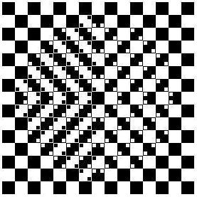
When all the small squares (also called the ticks) are removed from the larger squares (also called the checks), the bulging illusion is eliminated. Therefore, the ticks, both white and black ones, in the checks must play an essential role in the illusion. Now we have to ascertain how much of a role either the white ticks or the black ticks play in the illusion. In the figure on the left below, I have taken out all the black ticks from the right side of the bulging globe. Without the black ticks on its right side the bulging effect of the globe is not weakened very much. In the figure on the right below, all the white ticks are removed from the right side of the globe. Now the bulging effect of the right side of the globe has been severely reduced. These experiments demonstrate to us that the white ticks play a much more important role in the bulging illusion.
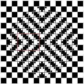
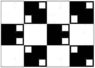
At this point, we have to take a closer look at the bulging illusion figure. I have cut out a small portion, which is shown as the red rectangle in the figure on the left below, from the left side of the bulging globe. As you can see, the red rectangle is not regular. Its right side is slightly wider than its left side; thus its top side slants downwards from right to left and its bottom side slants upwards from right to left. Also, both the left side and right side of the rectangle are bent toward left. Furthermore, all the vertical lines inside the red rectangle are bent like the sides; and all the horizontal lines within the rectangle are shaped like the top and bottom sides. The figure on the right below is the enlarged cut-out, which shows the same patterns as the red rectangle that I have just described.
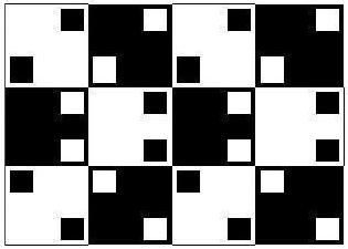
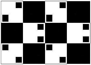
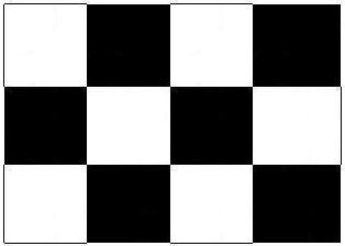
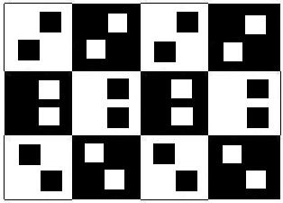
The three figures below are the same cut-out; but I have taken out all the black ticks for the one on the left, all the white ticks for the one in the middle, and all the ticks for the one on the right. As we have already known, the white ticks play a more important role than the black ticks in the illusion since the vertical lines with the white ticks are more bent and the horizontal lines with the white ticks are more tilted than those lines in the figure with the black ticks only, and the checks become perfectly regular without these ticks.


The next
puzzle we have to solve is why the checkerboard with the ticks appears
bulging out.
If we use the concept of perspective to explain that the center of the
globe seems to be closer to us and its edge seems to be further away
from us, then it would be incoherent. According to the perspective and
the size constancy theory derived from it,
for the objects that project the same size retinal image the farther
ones are perceived as bigger. If this is the case, the central part of
the checkerboard should be perceived as farther away rather than closer
since the checks there are perceived as bigger even though they are the
same size as those on the edge. As
a result, the checkerboard with the ticks would look like caving in
rather than bulging out if the perspective is the cause of the
illusion. Then, what is the cause of the bulging effect?
The answer lie in the next article which offers some far more important
discoveries. In brief, the bulging effect has something to do with the
visual field volume; an object that occupies a larger part of the visual field seems to be closer than those occupying a smaller visual field. The checks in the central part of the illusory checkerboard is perceived as larger, therefore occupying a larger portion of the visual field and perceived as closer.
Thus far
you may be impressed with the effectiveness of the principle discovered
from the Helmhotlz illusion figure in explaining both the Cafè
wall and Bulging checkerboard illusions. However, the understanding of these illusions does not have as far-reaching implications as the illusions we are going to encounter next.
It merely proves that these illusions are influenced by a force beyond
our control and subjective interpretation and understanding. Now fasten
your belt. We are going to have quite a ride in the next articles.
TOP
References
Coren, S. & Girgus, J.S. (1978). Seeing is Deceiving: The Psychology of Visual Illusions. New Jersey: Lawrence Erlbaum Associates, Publishers.
Gregory R. L. (1997). Eye and brain: The psychology of seeing (5th ed.). Princeton University Press.
Grosof, D. H., Shapley, R.M., & Hawken, M.J. (1993). Macaque V1 neurons can signal “illusory” contours. Nature, 365, 550–552.
Kitaoka, A. (1998). Apparent contraction of edge angles. Perception, 27, 1209-1219.
Kitaoka, A., Pinna, B., and Brelstaff, G. (2004). Contrast polarities determine the direction of Café Wall tilts. Perception, 33, 11-20.
Kitaoka, A. (2007) Tilt illusions after Oyama (1960): A review. Japanese Psychological Research, 49, 7-19.
Myers, D. G. (2003). Psychology (7th ed.). New York: Worth Publishers.
Pritchard, R. M. (1961, June). Stabilized images on the retina. Scientific American, 72-78.
Shepard, R. N. (1990). Mind sights. New York: Freeman.
Wenderoth, P. (1992). Perceptual illusions. Australian Journal of Psychology, 44, 147-151.
Related Information on the Web:
http://en.wikipedia.org/wiki/Irradiation_illusion
http://www.springerlink.com/content/r778313424608881/
http://www.daviddarling.info/encyclopedia/I/irradiation_illusion.html
http://www.richardgregory.org/papers/cafe_wall/cafe-wall_p3.htm
http://www.michaelbach.de/ot/ang_cafewall/index.html
http://www.cs.ubc.ca/nest/imager/contributions/flinn/Illusions/CW/cw.html
http://www.michaelbach.de/ot/geom_KitaokaBulge/index.html
http://www.ritsumei.ac.jp/~akitaoka/cushione.html
http://www.psy.ritsumei.ac.jp/~akitaoka/resdownh.html
http://www.psy.ritsumei.ac.jp/~akitaoka/ECVP2010poster.jpg